


Big Data Is Nothing If Not Visual
Big data can be big chaos. But finding clarity -- and business opportunities -- in that chaos has never been more important.
Presenting data clearly and visually is now as important as finding it. Enter data visualization tools that create heat maps, data relationship trees, and geospatial overlays. They provide visual ways to explain a sales trend to the CEO in a few minutes. They turn data into a conversation.
This is the timely subject of Too Big To Ignore author Phil Simon's upcoming book, The Visual Organization: Data Visualization, Big Data, and the Quest for Better Decisions (Wiley, 2014), due out next month.
Simon sat down with InformationWeek to discuss how to become more of a "visual organization," the perils of being a big data laggard, and more.
IW: Phil, you emphasize in your book, The Visual Organization, that data visualization is more than just pie charts and pretty pictures that display data sets. What are key features and functions of contemporary dataviz tools that help organizations make better decisions?
PS: First, the best-of-breed dataviz tools these days are sophisticated. They can handle an array of data sources. They can easily accommodate not only internal enterprise data sources like relational databases, but external sources such as Twitter firehoses, third-party scripts, open datasets, charting libraries, and the like.
Second, they're not restricted to structured data linked via traditional drivers and ETL [extract, transform, load]. Many can handle semi-structured and even unstructured data sources from APIs. Third, they are interactive; that is, they do not merely present static data, they encourage data discovery and exploration.
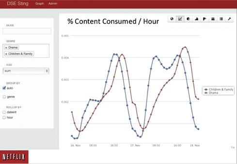
Source: Netflix Technology Blog
Fourth, they are much more user-friendly than the applications of years past. While technical sophistication is beneficial, you don't have to be a programmer or data scientist to make sense of data in Spotfire or Tableau, for instance. Finally, they lend themselves to sharing, both internally and for the outside world.
Read the rest of this article on InformationWeek